


The geography of jobs: Mapping the recovery has been saved
The geography of jobs: Mapping the recovery
01 July 2014
The current boom in energy production, the hangover from the housing bubble, and the long-term decline in manufacturing employment are combining to shift the employment profile of the US economy.
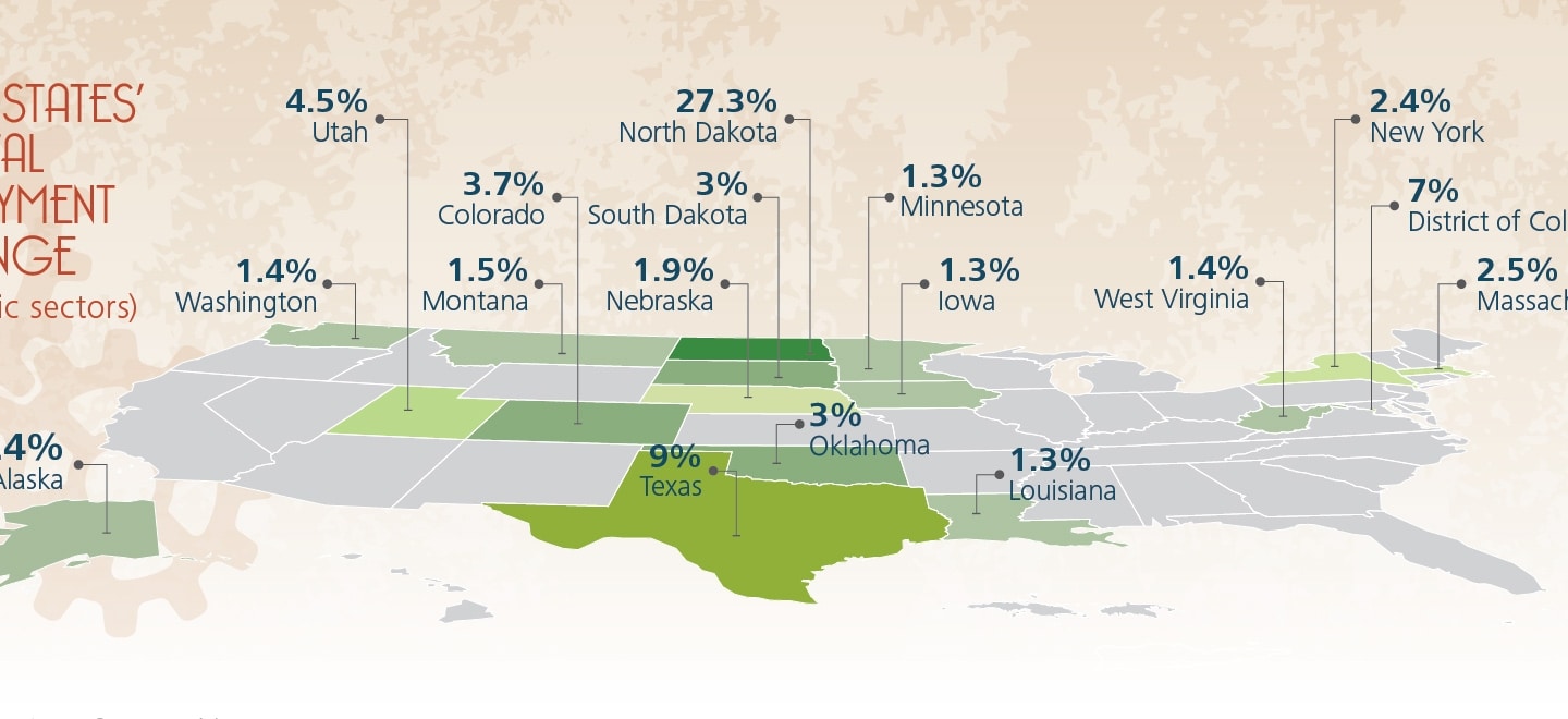
Only now, as we reach the fifth anniversary of the end of the recession, has employment in the United States finally regained its pre-recession peak. The national story of slow recovery obscures the more complicated regional picture: As is the case during most business cycles, the pace of recovery has been very uneven among the states. At present, only 16 states plus the District of Columbia have employment rates at least one percent higher than they had prior to the start of the recession. Among the states that have experienced the highest overall employment gains are the beneficiaries of expanding energy production.1 Among the states where employment remains substantially below pre-recession levels are those states most affected by the bursting of the housing bubble and those with declining manufacturing employment.
Recovery since the Great Recession: Uneven pace, uneven severity
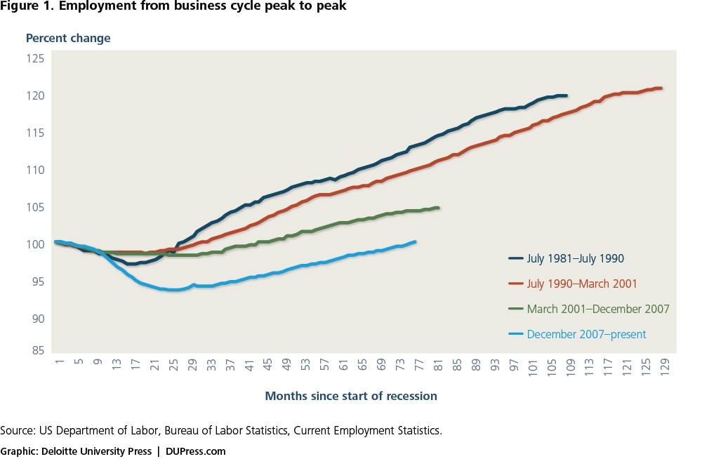
At 18 months long, the Great Recession that began in December 2007 and lasted through June 2009 was seven months longer than the average length of post-WWII contractions, and far deeper. During the course of the recession, the US economy lost 5.4 percent of total employment. Even after the recession officially ended, the economy continued to lose jobs for another six months, with a total decline of 8.6 million jobs. Following this large decrease, the economy has been very slow in regaining employment, as shown in figure 1.
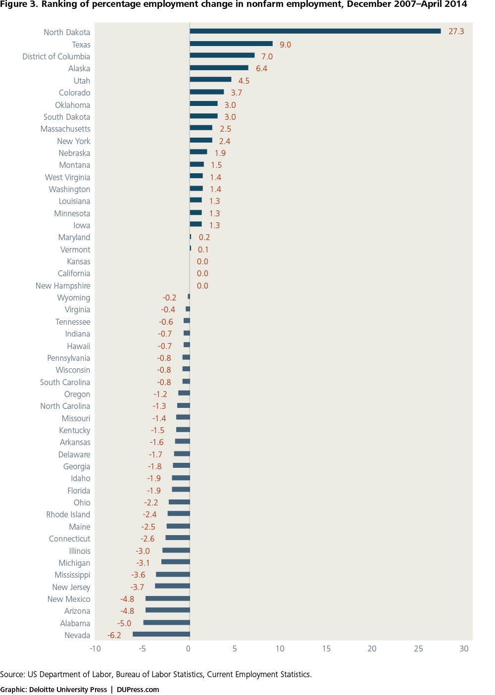
As shown in figures 2 and 3, only 16 states and the District of Columbia are at least one percent above their pre-recession employment levels. For more than half of these states (North Dakota, Texas, Alaska, Utah, Colorado, Oklahoma, Montana, West Virginia, and Louisiana), expanding energy production has played a key role in driving employment growth. The District of Columbia and the other employment-gaining states can attribute their total employment growth to increases in a variety of sectors, most notably health services and leisure and hospitality.

Most of these growth states also experienced a milder downturn during the recession, with smaller-than-average employment losses. For example, from the business cycle peak in December 2007 to the end of the recession, the District of Columbia lost 0.2 percent of its employment, New York lost 2.9 percent, and Massachusetts lost 3.4 percent—all much lower than the 5.4 percent for the US economy as a whole.
Four of these states (North Dakota, Colorado, Texas, and South Dakota) and the District of Columbia also had among the highest proportional increases in population due to inflows of people from other states between 2010 and 2013 (net domestic migration) as people moved to where the jobs were. Texas alone added more than 400,000 people from other states (1.5 percent of its 2013 population) during this period.2
The recession was significantly more severe for the states that fall at the bottom of the job recovery rankings; these states continued to lose jobs well after the end of the recession. Job creation did not pick up in Nevada and New Jersey until the beginning of 2011 and did not pick up in Alabama and Maine until the middle of 2011. It took until the middle of 2012 for employment to begin to grow in New Mexico.
Population also migrated away from the states at the bottom of the job recovery rankings: Of those in the bottom 10, New Jersey, Maine, New Mexico, Connecticut, Michigan, Rhode Island, and Illinois all lost population to domestic migration.3
For the 34 states that have either barely regained or have not regained their pre-recession employment levels, a wide variety of factors are at play, but two that have had a disproportionally negative impact on this group are losses in construction and manufacturing. These two sectors remain 20 percent and 12 percent, respectively, below their December 2007 levels for the economy as a whole.
Even after the recession officially ended, the economy continued to lose jobs for another six months, with a total decline of 8.6 million jobs.
Currently only North Dakota, the District of Columbia, and Oklahoma have more construction workers than they did in December 2007. Two of the states in the bottom 10 for employment recovery, Nevada and Arizona, were the hardest hit by the bursting of the housing bubble: At present, construction employment in Nevada is 51 percent below, and in Arizona is 42 percent below, their December 2007 construction employment levels. The other three states that remain at the bottom in terms of employment recovery—Alabama, New Mexico, and New Jersey—all have construction employment losses at least five percentage points higher than the national average.
Declines in manufacturing employment were even more widespread than construction job losses, with only Alaska currently having more manufacturing workers than when the recession began (a small jump of only 2,800 workers). Only five of the states in the top 16 for employment growth started the recession with their proportion of manufacturing workers higher than the national average of 9.9 percent. Among the states at the bottom, except those with the large construction employment losses mentioned above, those that entered the recession with relatively high manufacturing employment shares fared among the worst, including Mississippi, Michigan, Illinois, Connecticut, Rhode Island, and Ohio.
Because of their differential impacts on the states’ employment outcomes, the remainder of this report will look in depth at mining, construction, and manufacturing employment over this business cycle. These three sectors of the economy illustrate three different types of trends. First, the increase in mining employment reflects new developments in energy production—new sources and new techniques. Second, the slow and very incomplete recovery of construction employment represents a cyclical phenomenon driven by the bursting of the residential bubble in early 2006, almost two full years before the official start of the recession. Lastly, the decline in manufacturing employment represents a long-term trend where increasing productivity continues to drive down employment even as manufacturing output continues to rise.
To examine other industries or look at state industry distributions, please use the interactive chart features at the end of this report.
Between December 2007 and April 2014, mining employment increased by 171,000 to 852,000, with most of the gains coming from mining support activities such as exploration.
Mining: A changing trend in the American economy
Mining includes oil and gas extraction, coal and other mining, and support activities for mining. Between December 2007 and April 2014, mining employment increased by 171,000 to 852,000, with most of the gains coming from mining support activities such as exploration. Oil and gas exploration and production have been the major drivers of this growth, with coal production and other mining stable or falling. Between January 2007 and December 2012, monthly crude oil production increased by 39 percent, and monthly natural gas production increased by 25 percent.4
Most states with substantial mining employment relative to total employment experienced growth not only in mining employment (figure 4), but also in total employment. As shown in table 1, of the 12 states where mining employment comprised more than 1 percent of total employment in 2012, all but Kentucky increased in mining employment. The states with increasing mining employment generally experienced overall employment growth during this same period.5 The two mining states besides Kentucky where overall employment remains substantially below their pre-recession peak, Nevada and New Mexico, were among the hardest hit by the construction bust.
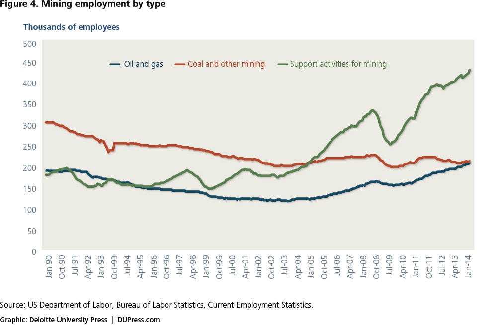
Table 1. Mining an important catalyst in states where it comprises more than 1.0 percent of total employment
| Mining employment as a percent of total employment | Mining employees 2012 | Change in mining employment from peak (number of employees) | Percent change in mining from peak | Percent change in total nonfarm employment from peak | |
| Wyoming | 9.9% | 27,687 | 341 | 1.2 | -0.2 |
| North Dakota | 5.9% | 24,376 | 19,277 | 378.1 | 27.3 |
| Alaska | 5.1% | 16,692 | 2,933 | 21.3 | 6.4 |
| West Virginia | 4.6% | 32,747 | 5,279 | 19.2 | 1.4 |
| Oklahoma | 3.8% | 58,059 | 11,471 | 24.6 | 3 |
| New Mexico | 3.1% | 23,988 | 4,610 | 23.8 | -4.8 |
| Louisiana | 2.8% | 52,141 | 4,115 | 8.6 | 1.3 |
| Texas | 2.5% | 270,032 | 64,560 | 31.4 | 9 |
| Montana | 2.0% | 8,745 | 1,271 | 17 | 1.5 |
| Nevada | 1.4% | 15,426 | 3,337 | 27.6 | -6.2 |
| Colorado | 1.3% | 30,224 | 5,205 | 20.8 | 3.7 |
| Kentucky | 1.2% | 20,299 | -1,484 | -6.8 | -1.5 |
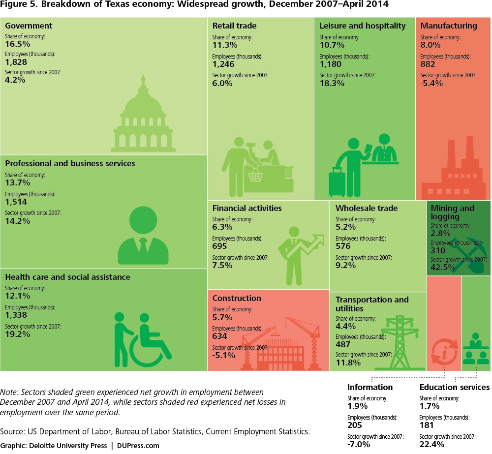
Part of the reason for the relationship between increased mining employment—specifically oil and gas extraction—and increased overall employment is the high multiplier effect of jobs in this industry, which various studies have pegged at between three and six additional jobs created in other industries for each job created in the oil and gas extraction industry.6 For example, Texas, which has a relatively high percentage of its employed population working in mining in addition to having the largest number of mining employees on an absolute basis, has had strong growth not only in industries related to oil and gas extraction, but also in other sectors as the Texas economy as a whole benefited from the catalyst provided by oil and gas (figure 5).
Construction: Effects of a cyclic trend
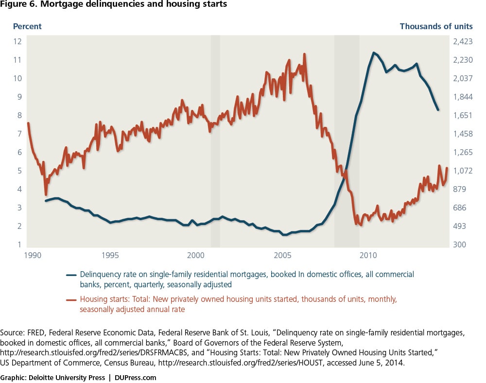
The bursting of the housing bubble, which occurred well before the recession started, set into motion the downturn that sparked a worldwide recession. As increasing delinquencies led to increases in foreclosures and the number of bank-owned homes skyrocketed, residential construction dropped by 80 percent between the beginning of 2006 and mid-2009, to levels not seen in the entire history of this series, which began in 1959 (figure 6). Although residential construction has started to pick up over the last few years, it still remains over 50 percent below its 2006 peak.7
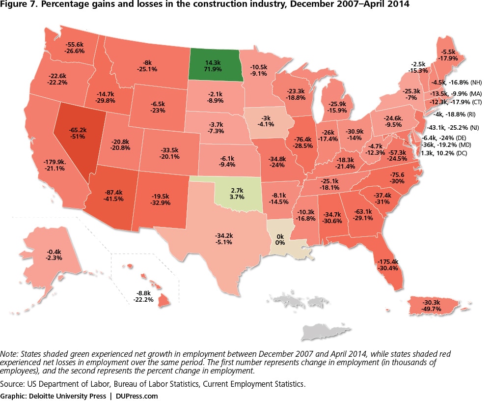
As shown in figure 7, declines in construction were widespread, and construction employment remains far below where it was in December 2007 (well after the decline began in most states). Only North Dakota, the District of Columbia, and Oklahoma have more construction workers at present than they had at the start of the recession.
Even though construction employment overall should regain additional ground, it may be unlikely, and perhaps even unhealthy for the economy as a whole, for construction employment to rise back to its bubble-driven December 2007 level, much less its 2006 level. Given shifts in where jobs are being created and evolving internal migration patterns, construction employment across the states should continue to deviate from its pre-recession distribution. But it is not just a question of demand factors: Supply factors will also determine where construction jobs will be created going forward. There remain substantial differences among states in vacancy rates both for rental housing and owner-occupied housing. For example, at the national level, rental vacancy rates averaged 8.3 percent in the first quarter of 2014, but states such as New Mexico, Utah, Mississippi, and Alabama have rental vacancy rates of over 13 percent, while states such as Oregon, Idaho, Montana, Wisconsin, and Maine have rental vacancy rates of below 5 percent.8
Although residential construction has started to pick up over the last few years, it still remains over 50 percent below its 2006 peak.
Manufacturing: A long-term trend exacerbates the impact of the recession
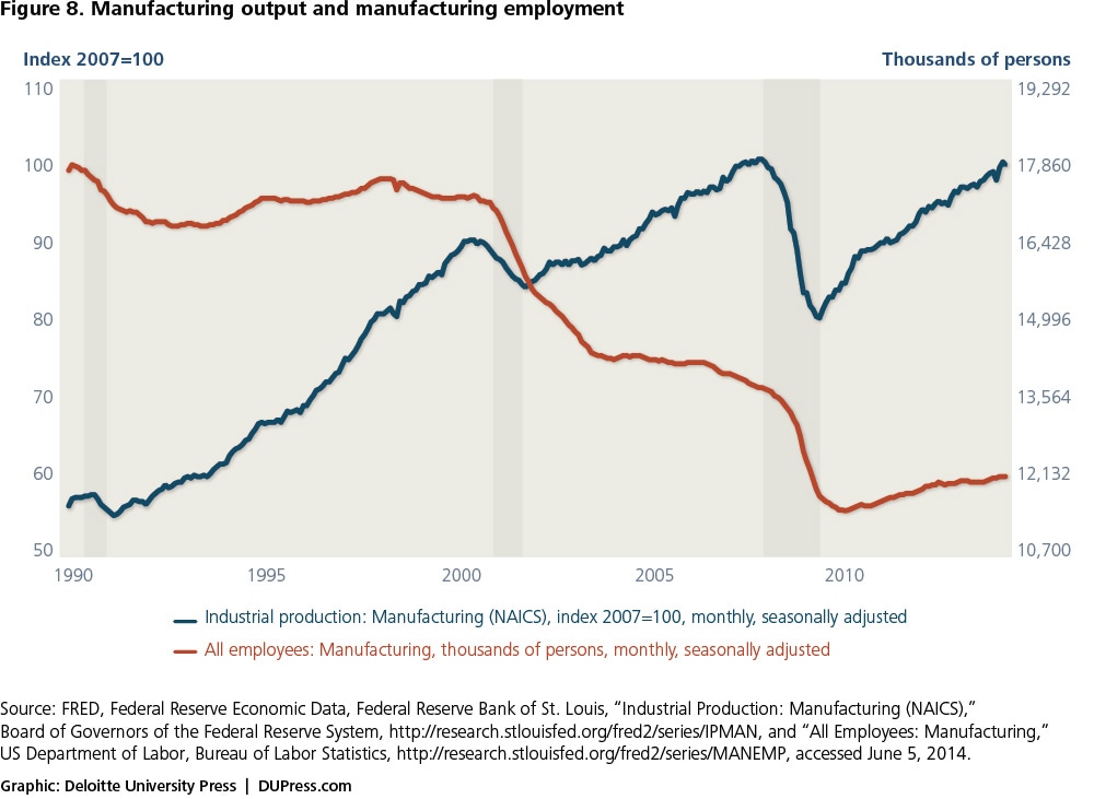
While the low level of construction employment is directly related to low levels of construction, this is not the case in manufacturing: Manufacturing output (figure 8) has returned to its pre-recession levels, while manufacturing employment remains depressed.9 The decline in manufacturing employment is a trend that began in the early 2000s as changing manufacturing processes led to increased labor productivity improvements.
Although manufacturing employment remains below its December 2007 level in all states except Alaska, the distribution of the losses has been uneven (figure 9). Limiting consideration to states that entered the recession with manufacturing employment of at least 100,000, 10 states now have manufacturing employment more than 15 percent lower than prior to the recession: New Jersey (-21.0 percent), Maryland (-20.9 percent), Arkansas (-17.9 percent), New York (-16.9 percent), North Carolina (-16.6 percent), Virginia (-16.4 percent), Florida (-15.5 percent), Mississippi (-15.5 percent), Georgia (-15.2 percent), and Alabama (-15.1 percent). In absolute numbers, the biggest losses have been in California (-200,000), Illinois (-98,000), Pennsylvania (-96,000), and New York (-92,000).

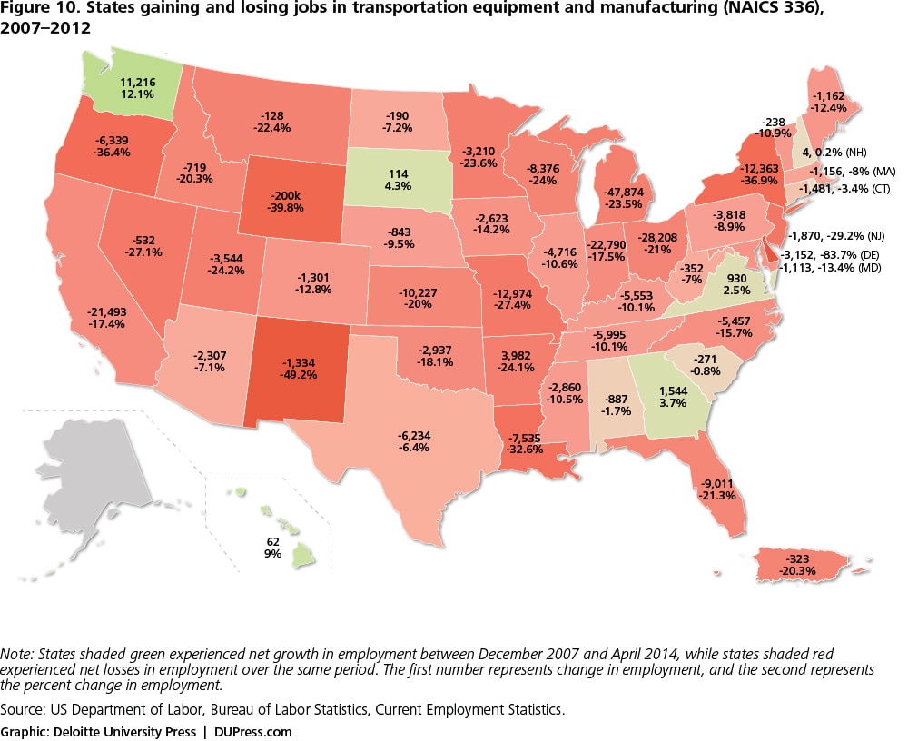
However, as shown in figure 10, the manufacturing sector does contain a few bright spots. Manufacturing losses have not been equally bad in all sectors and regions: For example, in the transportation equipment and manufacturing sector, employment has actually increased in Washington, Georgia, Virginia, and South Dakota, even as some other states have suffered huge losses.
The decline in manufacturing employment is a trend that began in the early 2000s as changing manufacturing processes led to increased labor productivity improvements.
The next chapter: Digging deeper into the complexities of the recovery
Highlighting these three trends in the housing, mining, and manufacturing sectors only scratches the surface of the information available about the recovery from the Great Recession of 2009. Complex shifts in employment are occurring throughout the American economy, with unique mixtures of gains and losses sweeping across the spectrum of industries and in different regions of the country. Each industry or state sparks our curiosity to ask what particular combinations of forces are driving the patterns we observe. For readers who share that curiosity, we have prepared a series of interactive graphics that will allow you to interrogate the employment data yourself. The interactive charts will allow you to zoom in on individual states and consider the sectoral composition of their economy, their differential recovery by industry, and the relationship between population change and employment change. To access the charts, visit dupress.com/articles/geography-of-jobs-interactive/.
As you interact with these economic displays, we also invite you to share your insights about the geography of jobs with other readers. As you discover new patterns and trends in these interactive charts, please tweet them to #GeographyofJobs, and join the conversation!
Recessions and their subsequent recoveries reshape the employment landscape—and the Great Recession and its aftermath are no exception. Future issues in this series of articles will examine some of the implications of these changes for the complex patchwork that is the US economy.
View an infographic of employment trends at dupress.com/articles/geography-of-jobs-infographic/.
© 2021. See Terms of Use for more information.
