What is US national income telling us? Economics Spotlight, June 2019
5 minute read
27 June 2019
GDP is the most popularly used measure to judge the state of the economy. But national income may give a different picture.
Economists may not be accountants, but economists have created their own accounting system: the National Income and Product Accounts (NIPAs). International standards guide national statisticians (such as the US Bureau of Economic Analysis) in providing measures of the state of the economy. Business decision-makers typically encounter one summary measure from these accounts: gross domestic product (GDP) as the sum of different types of expenditures. This equation takes pride of place in economics textbooks, and in most economic analysis of the state of the economy:
GDP = C+I+G+X-M
The equation tells us that total production is the sum of production for consumers (C), business investment (I), government (G), and foreigners—or exports (X), minus goods and services provided by foreign producers—or imports (M). Why are imports subtracted? Because imported goods and services find their way into the other categories—consumption, investment, government spending, and even exports (they can be intermediate inputs). However, imports are not part of domestic production, so it’s important to subtract them. Given appropriate data, an economist can describe what is happening in each category, which makes for a coherent and clear description of the state of the overall economy.
But there are other ways to measure the economy. In fact, the NIPAs are a kind of double-entry bookkeeping system, based on the idea that every dollar of goods and services produced creates a dollar of income for some producer. Measuring total national income should (in theory) provide the same estimate as measuring production. But the components are different. Here’s the equivalent equation for national income:
NI = W+K+R+P
Total income (NI) is the sum of the income of all factors of production. These include labor income (W), capital income (K), rents on land including the value of natural resources (R), and income of business proprietors (P), which cannot easily be separated into capital and/or labor income. (Proprietors’ income is not a useful theoretical concept, but it’s necessary to collect the data this way. Some economists have attempted to divide proprietors’ income into labor and capital, but for most purposes it is not necessary.) Capital income is, in practice, divided into corporate profits (noncorporate profits are included in proprietors’ income) and interest income.
In theory, the two different methods should provide a check on each other. They should be close, with only a small measurement error. And, mostly, that’s the case. Between 2005 and 2018, the discrepancy between them averaged less than 1 percent. That’s pretty good, considering that the two methods use completely different source data to measure the economy. It gives us some confidence that we do understand the size and dynamics of the economy by looking at GDP.
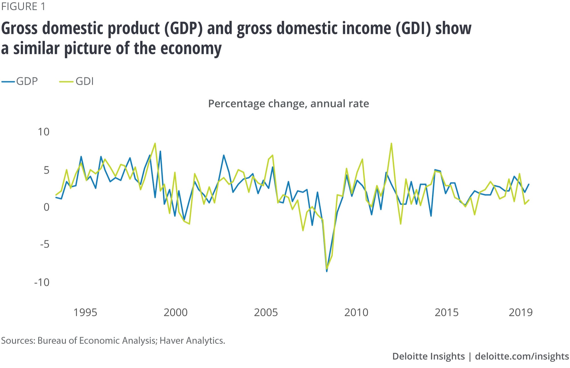
Figure 1 shows real GDP and real gross domestic income (GDI), the precise income counterpart of GDP. (There are a few technical differences between GDI and national income: for the sake of simplicity, both terms will be used interchangeably in this article.) GDP and GDI generally show the same picture of the economy. Income is more volatile, but the trends are pretty much the same.

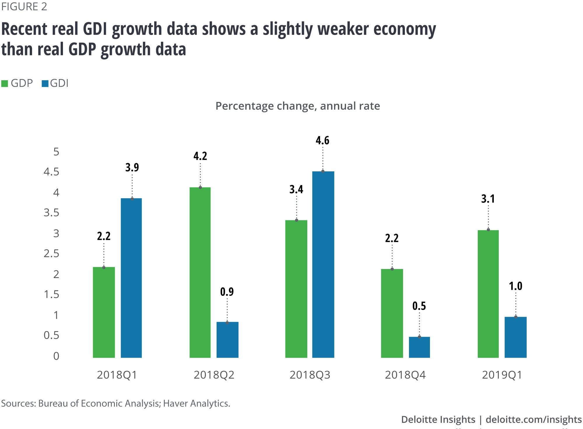
Figure 2 shows the overall picture of the economy in recent quarters as given by real GDP and real GDI. Real GDP shows a consistently strong economy, growing at over 2 percent each quarter, and over 3 percent in three of the last five quarters. Real GDI paints a weaker picture: Two quarters show very strong growth, but three quarters (including the last two) show extremely weak growth. NI may indicate that the economy is weaker than what the strong real GDP data might indicate.

Since 2015, the Bureau of Economic Analysis (BEA) has been publishing gross domestic output, which is the simple average of the two measures.1 However, most economists continue to pay closer attention to GDP—despite the fact that research suggests that income may be a better early indicator of economic downturns.2
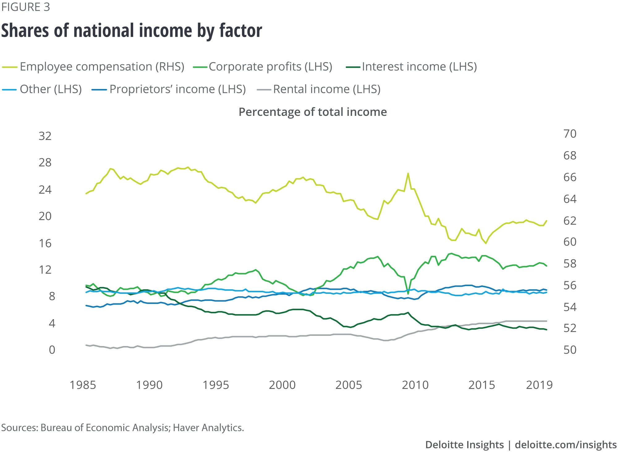
Another useful feature of NI is that the components tell a different, if complementary, story about the economy. Instead of the familiar expenditure sectors, income tracks the fortunes of different types of producers. Figure 3 shows the shares of national income each factor of production receives.
The largest share by far—around two-thirds of total income—goes to labor. This includes all wages and salaries, bonuses, and the value of fringe benefits, including employer-paid health insurance. A key feature of long-term economic change in the United States is the falling share of labor income. The share is somewhat cyclical—more precisely, profits are very cyclical, and when they fall during recessions, the share of labor income rises. But it has been trending down, from an average of over 66 percent of national income in the 1980s to around 62 percent today.
As labor’s share has been falling, corporate profits have been rising as a share of national income, from about 9 percent in the 1980s to an average of 13 percent in the last 10 years.
Rental income is mainly income from natural resources (especially energy). It has been gradually rising, reflecting higher resource prices and, since around 2010, the increase in energy production in the United States.
Interest income has been gradually falling, reflecting the decline in interest rates over this period.
Other income includes government income from production of goods and services and indirect taxes (such as excise taxes and tariffs). These are normally relatively unimportant, and the share of that income has been stable over time.

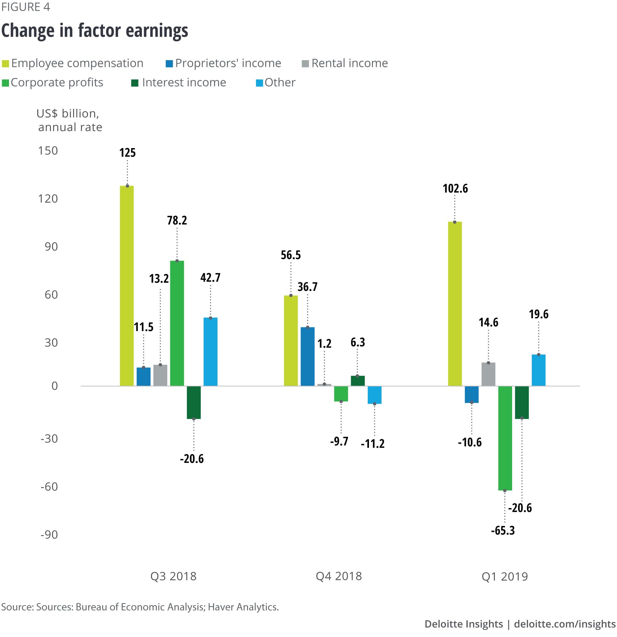
Recent trends of income show the economy in a different light than what the GDP data indicates. Figure 4 shows the growth in dollars in each of those six categories.
Employee compensation accounts for most of the growth of income in the recent past. In the most recent quarter, it alone accounted for more than the total income growth, as other income categories fell.
Corporate profits have swung from a net contributor to NI growth in Q3 2018 to a net subtractor from NI growth in Q1 2019. While this category can be volatile, the potential trend is worrying—particularly for business investment. If profits don’t snap back, business spending is likely to remain subdued.
The “other” category has been an unusually large contributor to NI growth. That’s because it includes indirect taxes such as tariffs, so the rise in federal tariff collections is measured here. The rise in indirect taxes is likely at the expense of other categories (exactly which categories is a question of some debate among economists). Thus, some of the decline in profits may reflect rising taxes that corporations are unwilling to pass on to their customers.

The income side’s picture of the economy is considerably more pessimistic than the expenditure side. While measured production has grown quite quickly, measured income has grown more slowly. That suggests the measure of production may be revised down in the future. And while labor compensation has been growing, most other income types did not grow in the most recent quarter. Worse, profits declined—perhaps partially because of higher taxes—leaving corporations with fewer resources to spend on investment. The other side of the double-entry bookkeeping system suggests, some caution would be in order before celebrating the recent strong growth of GDP.
More from the Economics collection
-
How the financial crisis reshaped the world’s workforce Article5 years ago
-
Q1 2019 US Economic Forecast Article5 years ago
-
Consumers in advanced economies: A tussle between tailwinds and headwinds Article6 years ago
-
Rising corporate debt: Should we worry? Article5 years ago
-
All in a day’s work—and sleep and play: How Americans spend their 24 hours Article6 years ago
-
Issues by the Numbers, July 2018 Article6 years ago


